How We’re Borrowing From Wearables, Spotify, and LEGO®s to Make Science User-Friendly
Let’s be honest: Enterprise software has a reputation, especially software made for specific vertical industries like laboratory and scientific management. It’s usually dull, clunky, and designed by engineers who think “user interface” means 18 drop-down menus and a table with 47 columns.
We’ve all been there. You open your lab management system and immediately feel like you need a Ph.D. just to find the “Save” button. The fonts are inconsistent. The colors assault your eyes. And good luck trying to do anything on your phone.
At Elemental Machines, we reject the premise that “scientifically rigorous” has to mean “painful to use.” If you can book a flight on your phone in 90 seconds, why should checking a freezer temperature feel like streaming Netflix on hotel WiFi?
We believe the best science happens when your tools get out of your way. That’s why we obsess over user experience (UX) just as much as we obsess over sensor calibration.
From Wearables to the Wet Lab
Our obsession with design isn’t an accident. Before founding Elemental Machines, our Chief Strategy & Technology Officer, Sridhar Iyengar, founded Misfit,1 a wearables company that made fitness trackers people didn’t want to hide under their sleeves. In the consumer world, bad UX means your product gets abandoned fast. The bar for adoption and “user delight” is incredibly high, as consumers have come to expect Apple-esque user experiences from just about everything.
Srid brought that same “consumer-first” mentality to enterprise products, specifically to the laboratory. He understood that a lab manager checking equipment at 2 a.m. deserves software that’s as responsive and intuitive as their Apple Watch. And research backs this up: Studies of laboratory information systems show that poor usability leads to errors and workarounds that compromise data integrity and patient safety.2 These are exactly the problems we’re solving.
Srid didn’t stop there. He brought teammates with him who shared that same consumer-grade design obsession. These were people who’d worked on products where user experience wasn’t just a nice-to-have, it was the main differentiator.
We’ve also had product leadership from Bose, LEGO®, Amazon, and Fossil. You might wonder what plastic bricks, headphones, watches, and one-click shopping have to do with lab assets, but the philosophy is identical: intuition and user delight.
A five-year-old doesn’t need a manual to start building with LEGO®s or even place an order on Amazon (just ask the parents of the toddler who ordered $4K worth of toys all on her own). These systems just make sense. We believe lab software should feel that easy, not like assembling IKEA furniture without instructions.
Science Meets Spotify: The Features
We designed our enterprise software platform to be visually engaging because visualization is a form of intuition and intelligence. If you can glance at a screen and immediately understand the health of your lab. That’s not just “pretty” — that’s efficient.
Here’s how we bring consumer-tech design to your daily workflow:
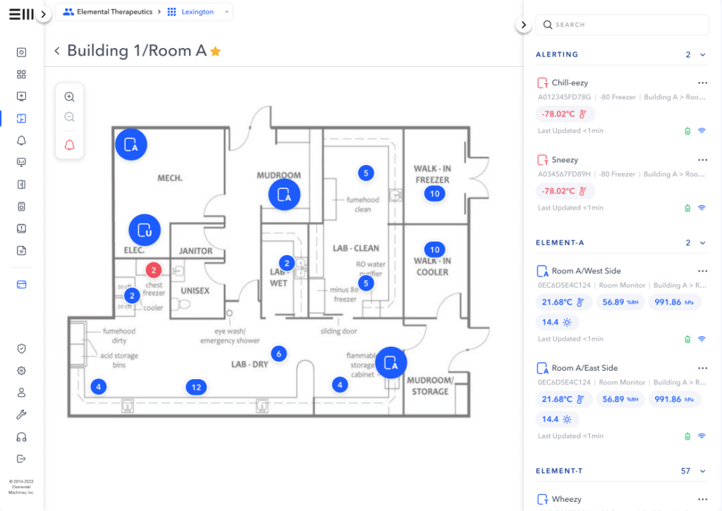
1. Interactive Floorplans (The “Google Maps” Approach)
Forget Excel spreadsheets with cryptic equipment IDs like “FRZ-002-B57.” Our interactive floorplans let you see your lab layout and click on any asset for instant access to its data, maintenance history, and real-time status.
It’s wayfinding that feels natural, because why should finding your equipment be harder than finding a coffee shop?
2. Custom Dashboards (The “Spotify” Approach)
Not everyone needs the same view. A lab manager cares about different metrics than a facility director. Our Custom Dashboards let you configure exactly what matters to you, then save and share those views with your team.
Think of it like your Spotify home screen: personalized, relevant, and set up in seconds.

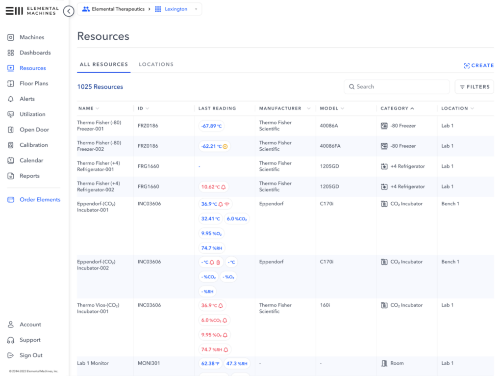
3. Resources (The “Photo App” Approach)
We took the chaos of asset management, which is usually a nightmare of shared drives and nested folders, and turned it into a clean, scannable interface. It uses familiar spreadsheet-style filtering with powerful search, so you can find a calibration certificate in two clicks instead of twenty.
Clean. Simple. Intuitive. Just like browsing your photos app.
Does Design Actually Matter?
You might ask, “Does it really matter if my lab software looks nice?”
Yes. Because clunky software leads to workarounds.
When an asset management system is painful to use, people stop using it. They go back to spreadsheets and Post-it® notes. Critical maintenance is missed. Documentation gaps appear. And suddenly, you’re scrambling to prepare for an audit because half your team gave up on “the system” months ago.
Research confirms this pattern: A recent scoping review of electronic health records found that 61% of workarounds arise from poorly designed functionality rather than deficient training, leading to duplicative entry, external note-taking, and increased compliance risk.3 These are the issues plaguing lab operations.
What does this mean? Good UX isn’t just about aesthetics. It’s a compliance supercharger.
When software is intuitive:
- Lab teams actually log their maintenance activities
- Scientists book equipment properly instead of just showing up and hoping it’s free
- Documentation gets stored in the right place because it’s not a hassle
- Managers check their dashboards proactively instead of reactively
Better user experience leads to better data. Better data lead to better decisions. Better decisions lead to better outcomes.
The Science Behind the Screens
Now, let’s be clear: Beautiful design means nothing if the underlying technology doesn’t work.
Elemental Machines was built by scientists and engineers who understand the chaos of lab life. We know that a freezer alarm at 3 a.m. needs to be actionable, not just informative. We know that GMP documentation needs to be audit-ready, not just stored somewhere. We know that equipment utilization data need to be accurate enough to guide million-dollar capital decisions.
That’s where our dual DNA comes in.
We combine:
- Deep scientific and engineering expertise (our hardware is designed and manufactured in-house)
- Consumer-grade design philosophy (from teams who’ve built products millions of people use daily)
The result? Lab intelligence software that’s both scientifically rigorous and genuinely enjoyable to use. You get NIST-traceable calibration and 21 CFR Part 11 compliance, wrapped in an interface that doesn’t make you want to throw your laptop out the window.
The Future Is Friendly
Enterprise software has been stuck in the Dark Ages for too long. Clunky interfaces. Confusing workflows. Mobile experiences that make you squint and pinch-zoom until your fingers cramp.
We’ve got the cure for that.
We’re combining the intuitive ease of consumer electronics with the rigorous performance needed for regulated environments, because you deserve lab software that works as hard (and looks as good — wink, wink) as you do.
Ready to Upgrade Your View?
Request a demo and see what lab software looks like when it’s built by people who actually care about user experience.
References
1 Wikipedia. Misfit (company). https://en.wikipedia.org/wiki/Misfit_(company)
2 Agharezaei, Zhila, Reza Khajouei, Leila Ahmadian and Laleh Agharezaei. 2020. “Compliance With Design Principles: A Case Study of a Widely Used Laboratory Information System.” Eastern Mediterranean Health Journal, vol. 26, no. 12, pp. 1456–1464. World Health Organization. https://www.emro.who.int/emhj-volume-26-2020/volume-26-issue-12/compliance-with-design-principles-a-case-study-of-a-widely-used-laboratory-information-system.htm
3 Olakotan, O., Samuriwo, R., Ismaila, H., et al. Usability Challenges in Electronic Health Records: Impact on Documentation Burden and Clinical Workflow: A Scoping Review. PMC. Published 2024. https://pmc.ncbi.nlm.nih.gov/articles/PMC12206486/